Designing a visually compelling landing page to promote inclusion of closed captioning and advocate for the hard-of-hearing community and beyond.
Overview
Advocating for Accessibility
As a hard-of-hearing and cochlear implant user myself, drawing from my experiences, I designed a persuasive landing page in collaboration with the Canadian Hard of Hearing Association (CHHA) with a focused call to action to advocate for closed captioning across multiple forms of media and digital platforms for equal access for the hearing disabled. I achieved my goal to create a visually compelling page to communicate the struggles and needs of the hard-of-hearing community by using rhetorical visual tropes and illustrative design to evoke empathy and motivate users to support the cause.
Problem
Bridging the Communication Gap with Closed Captioning
For individuals who are hard of hearing or deaf, the lack of closed captioning creates a disparity in how these individuals, including me, experience content, limiting their ability to engage, learn, and connect on an equal level with the hearing community. Closed captioning is not just a convenience—it is a necessity. It bridges the communication gap for over 1.3 billion people worldwide with hearing disabilities, empowering them to fully participate in society. Beyond the hard-of-hearing community, closed captioning also benefits non-native speakers, individuals in noisy environments, and those seeking to consume content without audio. Despite growing awareness, the implementation of accessible solutions remains inconsistent, leaving millions without the tools needed for full inclusion.
Challenge
How might we create an engaging and persuasive landing page using rhetorical tropes to advocate for universal closed captioning?
Solution
Evoking Empathy Through Visual Storytelling
I designed a landing page with rhetorical tropes including metaphors, similes and personification to represent the experiences of those with hearing disabilities and resonate with the users emotionally. Bold, minimalistic visuals and color blocking were used intentionally to create a clean, engaging aesthetic. The page was visually structured to guide users through these symbolic elements, culminating in a clear call-to-action to advocate for universal use of closed captioning.
Phase 1: Discover 🔍
Secondary Research
Understanding Accessibility Needs
I looked into the statistics of the hard of hearing population in Canada and gathered information through secondary research on the needs of accessibility tools and the impact of closed captioning has on the community. This informed the focus of the landing page- it should allow users to empathize with those affected and feel encouraged to advocate for the cause supported by the Canadian Hard of Hearing Association. The importance of this cause is personal to me and it is evident as closed captioning aids individuals who are deaf or hard of hearing by improving their ability to comprehend and engage with media, fostering their inclusion in the hearing community.
Over 1.3 million Canadians have a hearing disability. In 2017, 40% of Canadians aged 15 to 44 with a more severe hearing disability used closed captioning or subtitles, compared to only 15% of those aged 65 and older.
Source: Canadian Survey on Disability, 2017
Phase 2: Define
Empathy Mapping
Highlighting Perceptions and Frustrations
Based on my personal experience and secondary research through forums and articles, I focused on emphasizing on why many people might not see the importance of closed captioning to define what my landing pages need in order to make an impact across all audiences.
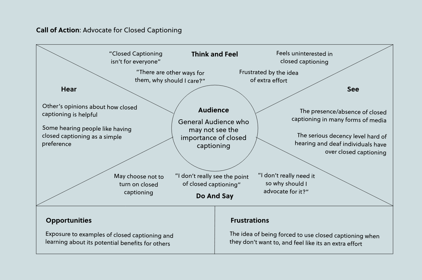
There were three main findings obtained:
They viewed closed captioning as unnecessary gimmick
They felt frustrated by the idea of an extra effort to add into the content and materials
They aren’t able to fully grasp the critical role it has on those who need it
Synthesis
Let's get to building
My landing page will focus on using rhetorical tropes and visual imagery to actively encourage users to empathize and understand the opportunities closed captioning opens for others. The landing page is targeted towards general audience who may not understand the impact of inclusion of closed captioning across all media formats.
Art Direction
Setting a Visual Tone for Advocacy
I started by drawing inspiration from minimalist, illustrative styles and creating a bold colour scheme sourced from Pinterest with a focus on reflecting the Canadian Hard of Hearing Association (CHHA)'s branding while modernizing its simplistic style of its original website in collaboration to this project.
Phase 3: Develop 🎨
After an initial brainstorming session to generate ideas, I started prototyping and refining the visual concepts. Using Procreate, I focused on hand-drawn visuals to add a unique and personal touch with the freedom to customize the illustrations fit to the content of the landing page. Inspired by Magritte’s “The Son of Man", I experimented with replacing faces with objects, adding a symbolic layer that aligns with the project’s advocacy theme.
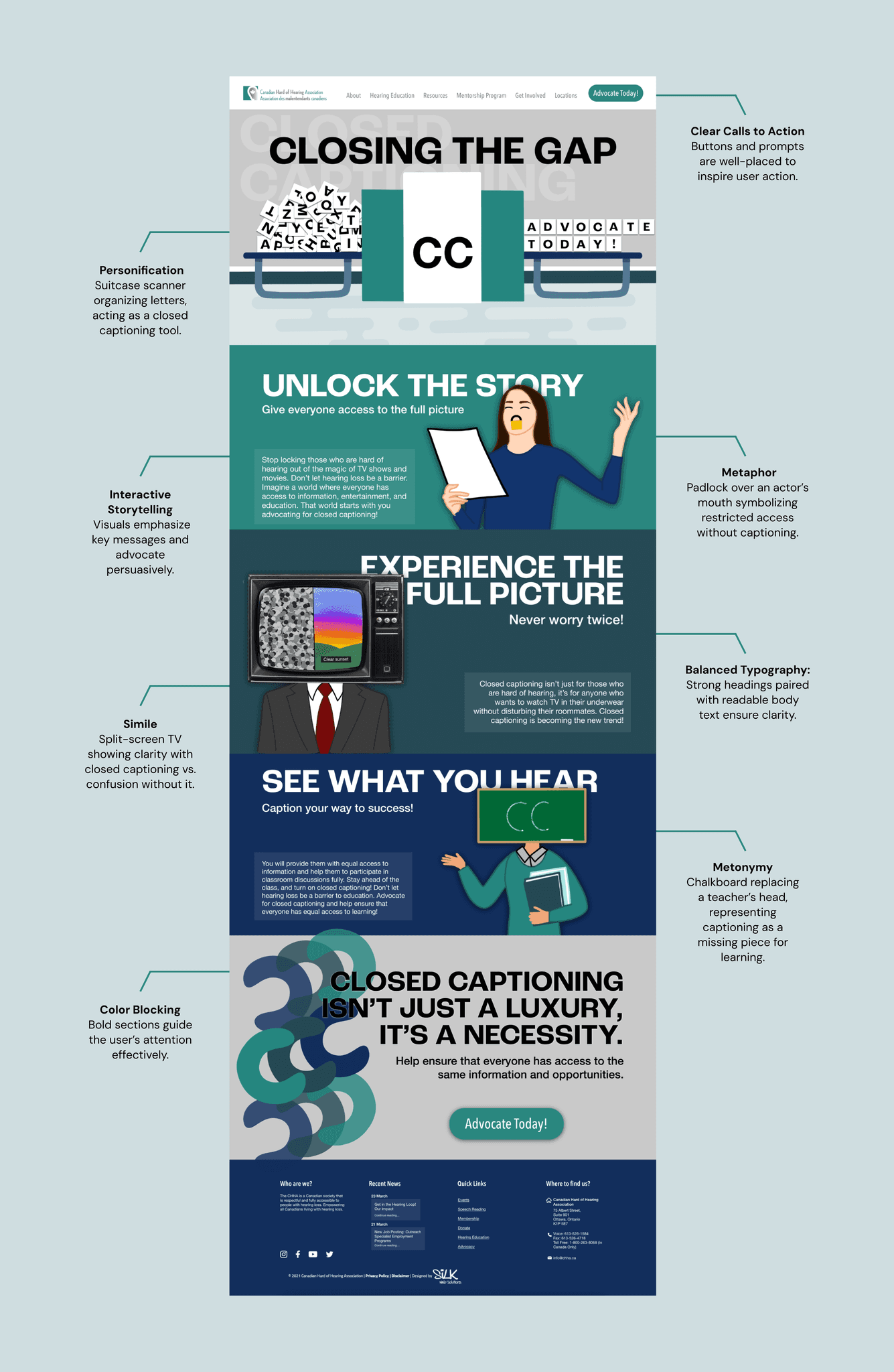
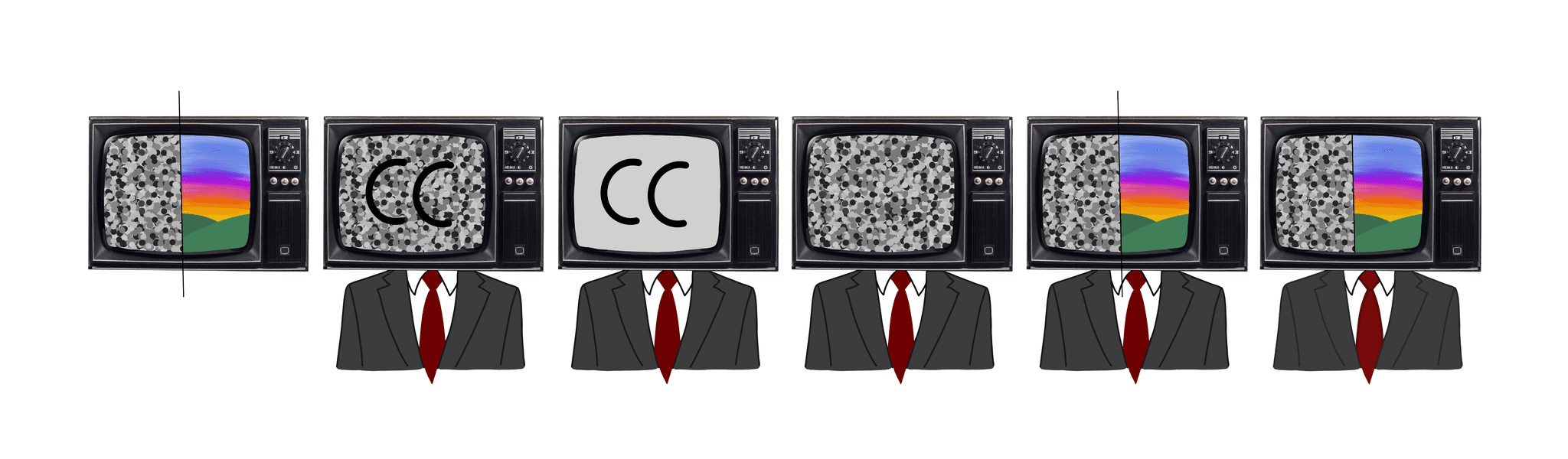
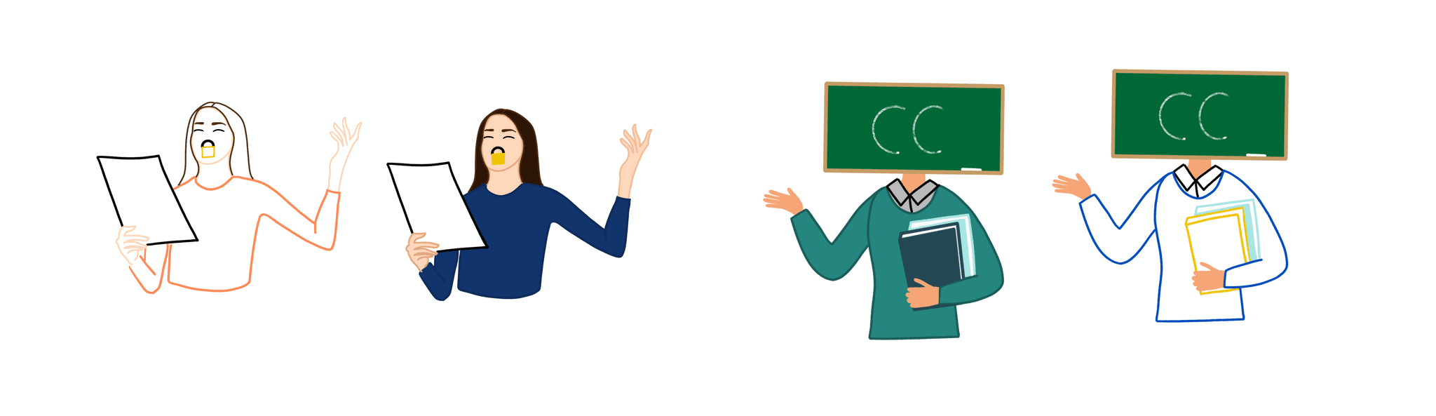
Rhetorical Trope #1: Simile
Illustrating Accessibility
To convey the impact of closed captioning, I created a visual simile combining photographic element of a TV and illustrative element of a split screen where a side shows a blurred, static-filled image indicating incomprehension while the other side is colourful and clear as the sky, symbolizing how captioning makes content accessible for hard-of-hearing individuals. Replacing the person's head indicates it as the missing piece for the television. The last design was the best representation for the message I wanted to communicate.
Rhetorical Tropes #2 & #3: Metaphor & Metonymy
Creating Impactful Storytelling
With the intention to use metaphor and metonymy to relay the message, I drew an illustration of an actress with a padlock over her mouth, representing metaphorically her voice being blocked from the hearing impaired/disabled, unable to understand her at all. Additionally, I drew an illustration of a teacher with her head replaced with a chalkboard labeled “CC,” symbolizing how captioning provides assistance for a hearing impaired/disabled who may not be able to comprehend a lecture.
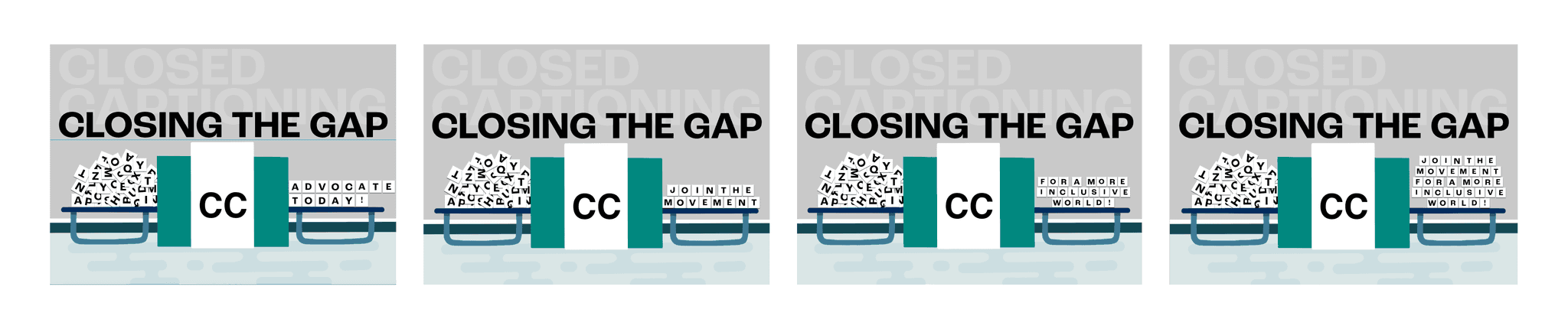
Rhetorical Trope #4: Personification
Let's Design the Call To Action
I used the concept of a suitcase scanner as a personification to represent closed captioning as an “organizer” of language, helping users comprehend content more clearly. I experimented with Scrabble-like letters, arranging them into different phrases to find the most impactful message. I eventually chose “Advocate Today,” as it directly encourages action and aligns with the site’s goal. This visual reinforces the theme of bridging the communication gap, making closed captioning feel like a necessary, active tool in creating inclusivity.
Phase 4: Deliver
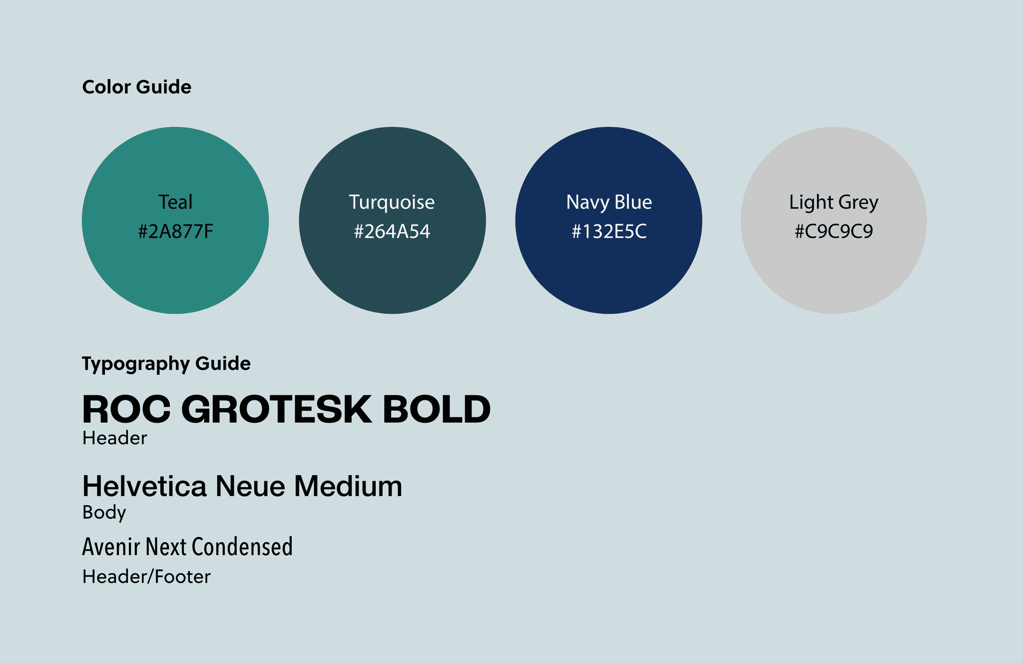
Color and Typography Guide
Reflecting the Branding
The colour palette of teal, navy blue, and light grey and a bold sans-serif font for headings and a readable serif for body text, extracted from the Canadian Hard of Hearing Association's brand reflects a professional, accessible look that ensures clarity and cohesion throughout the design.
Final Design
A Persuasive Advocacy Platform
The final landing page design presents a clear and engaging advocacy message, successfully using visual storytelling to raise awareness for closed captioning and inspire user support.
What I Learned
Effective Visual Communication
I learned how powerful visual storytelling can be in conveying complex advocacy messages, especially through the use of rhetorical devices.
Balancing Design and Accesibilty
Designing for accessibility taught me to prioritize clarity and inclusivity without sacrificing creativity.
User-Centered Design
I gained insight into the importance of user feedback in refining design elements to ensure they are impactful and resonate with a diverse audience.
Next Steps I Would Take
User Testing and Feedback
Conduct testing with users from the hard-of-hearing community to ensure the design and messaging are effective and inclusive.
Enhance Educational Content
Add additional resources, like an FAQ or infographics, to provide deeper insights into closed captioning benefits.
Refine Design Based on Feedback
Use insights from testing to make iterative improvements, enhancing clarity, accessibility, and overall user engagement.